
Welcome to the Official Page of David TV Barnes

Biography

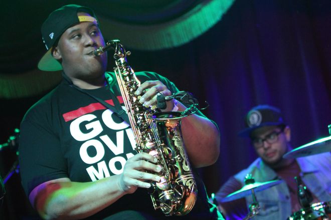
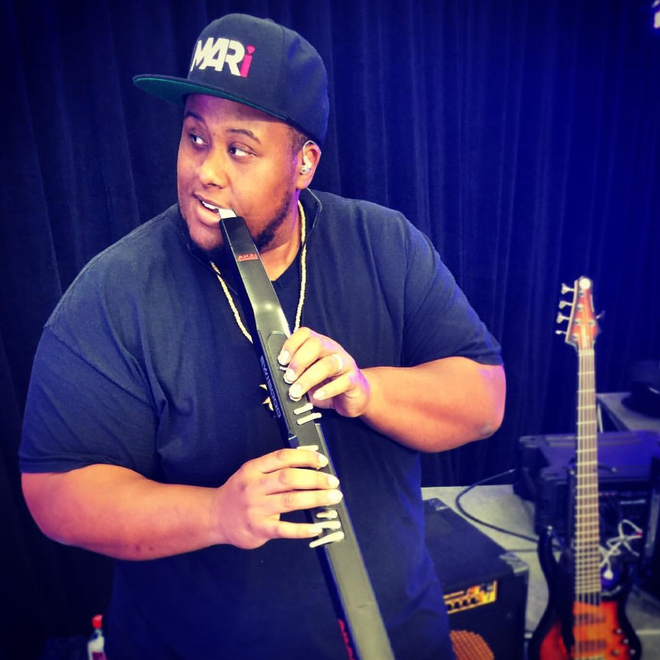
David Taelon Vosges (T.V) Barnes, one of the top American musician and saxophone player began his career as an 8 year old prodigy in Brooklyn,NY. Before his 18th birthday he was marching in Walt Disney World’s Parade of Lights with The New York City All-City Marching Band, performing for Mayor Bloomberg at Gracie Mansion (where Wynton Marsalis called him the best saxophone player for his age that he had ever heard) and teaching musicians and vocalists at Columbia University Teachers College Improv Camp. He has opened for Gladys Knight, Boyz II Men, Jimmy Cliff, Beres Hammond and others. Since then David has gone on to launch a successful solo career and has become famous saxophone player as well as working with some of the most in demand artists and musicians. He is a much sought-after artist in the Greater New York Area, including New York City and Long Island. You can see David performing in several states on the East Coast and working with up and coming guitarist Chris Bedward across many different genres. Since then David has added big and tall model to his resumé working with some of the top names in fashion and now he has become America’s next top model.

Press Photos

Status

New single “ just me & you” streaming everywhere at midnight 
https://distrokid.com/hyperfollow/davidtvbarnes/just-me–you-instrumental

Why the Saxophone Still Works in Modern R&B, Hip-Hop, and Live Performance

TLDR

  • The saxophone can function as a melody instrument, backing texture, solo voice, or rhythmic accent.
  • Its tone sits naturally beside the human voice, which helps it work well in R&B.
  • Hip-hop and DJ-driven performances give saxophonists room to improvise over grooves that were not originally built around live horns.
  • A live saxophone changes the energy of a performance because the musician can react to the room.
  • Modern saxophone players do not need to choose between jazz tradition and contemporary music.

The saxophone has survived a surprising number of predictions about its death.

Electronic instruments were supposed to replace it.

Then synthesizers.

Then sampling.

Then laptops.

Yet put a strong saxophone player beside a DJ, R&B singer, reggae band, or hip-hop artist and the instrument immediately makes sense again.

The reason is simple.

A saxophone does something that is hard to automate completely.

It reacts.

The Saxophone Sits Close to the Human Voice

Saxophones can whisper, shout, bend pitches, growl, swell into notes, and change tone in the middle of a phrase.

That makes the instrument feel unusually vocal.

R&B depends heavily on phrasing.

A singer may arrive slightly behind a beat, stretch one note, clip another, and change intensity from one word to the next.

A good saxophonist can answer that.

The horn does not have to fight the singer.

It can echo a phrase.

Fill the space after a lyric.

Hold a note underneath the vocal.

Or take over when the singer stops.

That conversational quality is one reason saxophone has remained useful across soul and R&B even as production styles changed.

Hip-Hop Gives Horn Players a Different Job

A saxophone in modern hip-hop does not need to behave like it is playing in a 1950s jazz club.

The beat may already contain bass, drums, samples, synths, vocals, and effects.

The saxophone needs to find the space that is still open.

Sometimes that means a short repeated hook.

Sometimes it is a few notes between verses.

Sometimes a player gets a full improvised section.

And sometimes the horn becomes another texture inside the production.

The instrument is old.

The job can be completely modern.

DJs and Saxophones Work for the Same Reason

A DJ controls a large musical environment.

Tracks can move through house, hip-hop, R&B, reggae, pop, or electronic music without the set stopping.

A live saxophonist can move through that environment too.

The musician hears the key, rhythm, and shape of the track and adds something that exists only in that moment.

That creates a useful contrast.

The underlying recording may be exactly the same one thousands of listeners have already heard.

The live horn is not.

One night the saxophonist holds a note because the crowd reacts.

Another night the player leaves more space.

A breakdown can become longer.

A call-and-response moment can appear without being planned into the original record.

That unpredictability is part of the attraction.

David TV Barnes’ current artist bio describes exactly this kind of cross-genre approach, moving between jazz, hip-hop, soul, experimental sounds, DJ sets, studio work, and live performance.

The Instrument Can Be Both Background and Lead

One of the saxophone’s strengths is that it does not need to occupy the same role all night.

During a vocal song, it can stay in the background.

During an instrumental break, it can become the lead.

Behind a DJ, the player may add only occasional accents.

Then one recognizable melody can suddenly pull all the attention toward the horn.

That flexibility is useful for modern performers who move through different kinds of events.

A jazz set, fashion event, club performance, festival, corporate event, and studio session may all ask for different versions of the same musician.

The instrument stays the same.

The musical judgment changes.

Improvisation Creates Risk

Recorded music is predictable.

That is one of its strengths.

Improvisation is not.

A player has to listen and make decisions in real time.

Sometimes the best decision is to play a lot.

Often it is to play less.

This is where experienced musicians separate themselves.

Playing over every empty space can turn a great track into a forty-minute saxophone solo that nobody requested.

The musician has to understand arrangement.

Where does the vocal need room?

Where should the horn enter?

Is this section building tension or releasing it?

Should the player follow the melody or deliberately move away from it?

Technique matters.

Taste matters more.

A Strong Horn Section Changes Records Too

Saxophone is not only a solo instrument.

Horn arrangements can reshape a record without demanding attention on every bar.

A short brass or saxophone figure can reinforce rhythm, lift a chorus, introduce a section, or create a signature sound people recognize within seconds.

Barnes’ official press materials credit him as a horn arranger, horn-section leader, and saxophonist associated with Sting and Shaggy’s 44/876 project.

The album itself won the 2019 Grammy Award for Best Reggae Album.

That kind of project shows how far horn playing can sit from the stereotype of a musician simply waiting for a jazz solo.

Arrangement is composition too.

The Saxophone Looks Alive on Stage

There is also a visual reason live horns continue to work.

Audiences can see the musician creating the sound.

Breathing.

Moving.

Reacting.

Stepping into the crowd.

Turning toward another musician.

A laptop can produce extraordinary music.

But the physical act of playing a wind instrument gives the audience another focal point.

At a live event, that can matter almost as much as the notes.

You Do Not Have to Pick One Genre

Musicians are often encouraged to brand themselves into one very narrow category.

That can make marketing easier.

It can also make the music less interesting.

Jazz vocabulary can work over hip-hop.

R&B phrasing can work in reggae.

A saxophone can sit over house music.

A musician who understands several musical languages has more ways to respond when the environment changes.

The key is not throwing every style into every song.

It is knowing which part of your musical background the moment needs.

Final Thoughts

The saxophone has stayed relevant because it is adaptable.

It can be smooth or abrasive.

Precise or loose.

Written or improvised.

It can support a singer, cut through a DJ set, live inside a horn section, or carry an entire melody by itself.

Modern production did not remove the need for that.

If anything, highly programmed music makes a strong live instrument stand out even more.

The saxophone is not surviving by pretending music never changed.

It survives because good players keep changing with it.

Sticker Merch Ideas for Musicians Fans Will Actually Keep

TLDR

  • Design stickers as objects fans want, not miniature advertisements.
  • Build designs around recognizable symbols, lyrics, album artwork, tour moments, and inside references.
  • Offer several formats, including die-cut stickers, sticker sheets, tour designs, and limited releases.
  • Use QR codes selectively and send fans to a useful, mobile-friendly page.
  • Display stickers where they can be seen from the front of the merch table.
  • Test small batches before ordering large quantities.

A fan might forget the exact set list, but the sticker placed on a guitar case, laptop, record shelf, or water bottle can keep the memory of a show nearby.

The strongest sticker merch ideas for musicians start with identity. Fans keep stickers that say something about the music and about themselves. A plain logo can work, but a memorable symbol, lyric fragment, character, or tour reference often gives the sticker more meaning.

The goal is not to fit your entire promotional plan into three inches. The goal is to make a small piece of band merchandise that earns a place on something the fan already owns.

Design for Recognition Before Promotion

A sticker has only a second or two to make sense. It needs one clear visual idea.

Start by identifying the elements people already associate with your music:

  • Band or artist logo
  • Album cover symbol
  • Recurring character
  • Stage prop
  • Instrument silhouette
  • Signature color combination
  • Lyric fragment
  • Song title
  • Tour artwork
  • Local reference
  • Symbol used in music videos
  • Illustration from a poster or record sleeve

Not every sticker needs the full artist name. Established fans may prefer a design that feels like an inside reference. New listeners, however, still need some way to connect the image with the musician.

A useful collection includes both:

  1. Direct designs with the artist name or logo.
  2. Fan-facing designs that work as art even without promotional text.

A fan-facing sticker is often the one that gets used. The direct logo sticker makes sure people can identify who it represents.

Use More Than One Version of the Logo

Placing the same logo on several shapes does not create a full sticker collection. Build genuine variations that serve different tastes.

Possible logo treatments include:

  • Full primary logo
  • Simplified icon
  • Initials or monogram
  • Handwritten version
  • One-color version
  • Distressed tour version
  • Circular badge
  • Vertical instrument-case design
  • Small symbol taken from the logo
  • Album-era reinterpretation

The simplified icon is especially useful. It may fit naturally on a phone case, pedalboard, notebook, or instrument case without feeling like a large advertisement.

Make sure each variation remains readable at the final printed size. Fine lines, tiny counters in letters, and subtle shading can disappear after reduction.

Turn Lyrics Into Designs Fans Understand

Lyric stickers work because fans already have an emotional connection to the words. But a lyric alone does not automatically create a good design.

Choose a line that is:

  • Short enough to read quickly
  • Recognizable to listeners
  • Visually distinct
  • Connected to a specific song or era
  • Understandable without a full verse
  • Appropriate for the places people may use the sticker

A short phrase can be paired with an icon from the song, handwritten lettering, or a small illustration.

Avoid shrinking an entire chorus onto a card-sized sticker. Fans should not need to hold it six inches from their face to read it.

You can also produce several lyric stickers as a sheet. Each design can represent a different song from the same album. This gives fans variety while keeping the product tied to one release.

Build Tour Stickers Around a Specific Moment

Tour merchandise feels valuable because it marks a time and place. A sticker can do this without becoming a miniature concert poster.

Tour sticker ideas include:

  • Tour name and year
  • Route map
  • List of cities
  • Van, bus, train, or airplane illustration
  • Venue-exclusive design
  • City-specific color variation
  • Backstage-pass-inspired layout
  • Faux road case label
  • Local landmark mixed with band artwork
  • “I survived the tour” joke
  • Final-show edition
  • Festival-specific version

A long list of dates may be difficult to read on a small sticker. Put the full routing on a larger sticker, backing card, or sticker-sheet header. Use individual city stickers when local exclusivity is part of the idea.

Keep a few tour designs available online after the shows, but consider reserving certain versions for the merch table. A genuine event-specific design gives fans a reason to visit the table that night.

Compare the Main Sticker Formats

Different formats support different kinds of artwork.

Sticker FormatBest UseStrengthWatch For
Die-cut stickerLogos, icons, charactersStrong standalone shapeThin projections may be harder to peel
Kiss-cut stickerDetailed art and added border spaceBacking protects the shapeLarger backing increases display size
Sticker sheetLyrics, symbols, album collectionsSeveral designs in one productSmall stickers need enough detail to feel useful
Clear stickerWindows, cases, clean logosBlends into the applied surfaceLight colors may lose contrast
Holographic stickerLimited releases and bold iconsChanges with light and movementFine artwork can compete with the effect
Bumper stickerLarge phrases and direct messagesEasy to read from farther awayRequires a design suited to a long shape
Transfer stickerSimple lettering and clean logosLeaves only the design behindNot suited to artwork with many separate details

Use the format that fits the artwork rather than forcing every idea into the same shape.

A detailed album illustration may work better as a kiss-cut sticker. A sharp band symbol may be ideal as a die cut. A set of small song references belongs naturally on a sticker sheet.

Make Sticker Sheets Feel Like Complete Merch

A sticker sheet should not look like leftover designs placed wherever they fit. Give the sheet a clear theme.

A strong music sticker sheet might include:

  • Main band logo
  • Album title
  • Two lyric fragments
  • Instrument or prop
  • Character or mascot
  • Small decorative symbols
  • Tour year
  • Hidden reference for dedicated fans

Use a consistent line style, color palette, and level of detail. Leave enough space around each sticker so fans can peel them easily.

The backing area can carry the album title, artist name, track list, or a short note about the collection. It can also make an unsigned sheet feel like an intentional release rather than a group of promotional stickers.

Use QR Codes With a Clear Purpose

A QR code can send fans to music, a mailing list, tour dates, a merch store, or a download page. Music website services commonly recommend QR codes at live shows and on stickers, tickets, and merch-table materials. Spotify also provides scannable Spotify Codes that can open an artist, song, or album inside the platform.

But the code should not dominate every design.

Before adding one, decide what happens after the scan. Useful destinations include:

  • A mobile landing page with listening links
  • A tour-specific page
  • A new single
  • A mailing-list signup
  • A free track or digital booklet
  • A music video
  • An online merch store
  • A page for the album represented by the sticker

A landing page is usually safer than linking to one temporary campaign. You can update the destination later without redesigning the entire fan experience, provided the QR code points to a URL you control.

Test the printed code on several phones. Scan it under dim venue lighting, at an angle, and through any laminate or special finish. Keep good contrast around it and do not crowd it with artwork.

And give the fan a reason to scan. “Listen to the new single” is clearer than an unexplained square code.

Choose Materials for Real Fan Use

Fans place music stickers on surfaces that get handled, carried, and exposed to moisture. Consider where the design is likely to go before choosing materials.

Durable vinyl is useful for:

  • Water bottles
  • Road cases
  • Instrument cases
  • Laptops
  • Car windows
  • Coolers
  • Helmets
  • Notebooks that travel frequently

Paper-based stickers may be suitable for:

  • Record sleeves
  • Journals
  • Scrapbooks
  • Indoor packaging
  • Collectible sheets that may never be applied

A laminate can improve resistance to scratching, moisture, and routine handling. Special finishes such as holographic, glitter, chrome, or clear material should support the design rather than replace it.

Order a physical sample before committing to a tour-sized quantity. Stage lighting, merch-table lighting, and colored venue lights can change how the artwork looks.

Give Fans Several Price Levels

Stickers can serve as an accessible item for fans who cannot buy a shirt, vinyl record, or higher-priced package.

A simple starting structure might be:

  • Single small sticker: $2 to $4
  • Large or specialty sticker: $4 to $7
  • Three-sticker pack: $8 to $10
  • Sticker sheet: $8 to $15
  • Limited signed or numbered pack: priced individually

These are examples, not fixed rules. Production cost, finish, size, venue, audience, and your overall merch pricing all matter.

Avoid creating six different prices for stickers that look nearly identical. Group similar products into clear categories and place the price directly beside them.

Decide When to Sell Stickers and When to Give Them Away

Selling and giving away stickers can both make sense, but they accomplish different things.

Sell Them When:

  • The artwork was created as a real merch product.
  • The design has a special finish.
  • The sticker is part of a set.
  • It is tied to a tour, album, or limited release.
  • Fans are already asking for it.
  • The packaging and presentation support a retail price.

Give Them Away When:

  • You want an easy item for new listeners.
  • The sticker promotes an upcoming show.
  • It is included with a larger purchase.
  • You are rewarding mailing-list signups.
  • The design is inexpensive and clearly promotional.
  • You are sending extras with online orders.

One useful approach is to sell the strongest designs and keep a simpler logo sticker as a purchase bonus. This protects the value of the main collection while still giving fans something accessible.

Do not automatically hand every visitor several free stickers. Fans who choose a design are more likely to value and use it.

Present Stickers Properly at the Merch Table

A small pile near the cash box is easy to miss. Give stickers a defined area.

Display ideas include:

  • Clear acrylic stands
  • Small grid panels
  • Sample stickers applied to a board
  • Sticker sheets clipped vertically
  • A shallow tray organized by design
  • A framed menu with numbered options
  • A rotating card display
  • A magnetic board, using display magnets rather than attaching adhesive
  • A small light near reflective or holographic stickers

Show every design without requiring customers to open sealed packs. Label products with simple names or numbers so the person handling the table can find them quickly.

A sign might read:

Singles: $3
Any four: $10
Sticker sheets: $10
Free logo sticker with any shirt or record

Keep backstock sorted in labeled envelopes or bins. Venue lighting is not the place to search through one large bag of nearly identical designs.

Bundle Stickers With Other Music Merch

Stickers are useful add-ons because they fit inside record mailers, shirt bags, CD packages, and poster tubes.

Bundle ideas include:

  • Album plus matching sticker sheet
  • Shirt plus two-sticker pack
  • Signed poster plus tour sticker
  • Vinyl record plus lyric sticker
  • Cassette plus retro label stickers
  • Deluxe album package with every album-era design
  • Ticket upgrade with venue-exclusive sticker
  • Mystery merch pack
  • Fan club welcome envelope
  • Guitar pick and sticker set

Music merch guidance often treats stickers, postcards, pins, patches, and similar small items as useful additions to larger fan bundles.

The bundle should have a clear theme. Adding a random sticker to an unrelated product may increase the item count, but it does not necessarily make the package feel considered.

Make Limited Releases Genuinely Different

A limited sticker should offer something distinct:

  • Alternate color
  • Specialty material
  • Numbered backing card
  • Signature
  • Venue name
  • Tour date
  • Different lyric
  • Retired artwork
  • Collaborative artist credit
  • Secret design revealed at the table

Do not call a standard logo sticker “limited” simply because you ordered a small first batch. You can always reorder it, and fans may reasonably assume that you will.

Reserve limited language for products with a defined release or a real production boundary.

Common Sticker Merch Mistakes

Treating the Sticker Like a Business Card

A sticker crowded with a website, social handles, streaming icons, and a long description is less likely to be used.

Making Every Design About the Full Logo

Some fans want recognizable band branding. Others prefer a subtler symbol or lyric reference.

Using Tiny Text

Print the design at its final size before ordering. If the lyrics are difficult to read on paper, they will not improve after printing.

Adding an Untested QR Code

A code that works on a monitor may fail after it is reduced, laminated, distorted, or printed over a reflective material.

Ordering Too Many Designs at Once

Start with a controlled batch. Let sales show which artwork deserves a larger run.

Hiding Stickers Behind the Table

Fans cannot buy designs they never see.

Ignoring Packaging

A simple backing card or labeled sleeve can turn loose stickers into a finished merch item.

A Practical First Collection

An independent musician could begin with five products:

  1. A primary logo die cut
  2. A smaller symbol sticker
  3. A lyric-based design
  4. A tour or album sticker
  5. A coordinated sticker sheet

Produce a modest first run. Sell them at several shows and record what happens.

Track:

  • Units sold by design
  • Bundles versus singles
  • Purchases tied to other merch
  • Designs requested after selling out
  • QR scans
  • Online orders after the show
  • Which stickers fans apply immediately

The results will tell you far more than guesses about what fans might like.

FAQs

What kind of band stickers do fans keep?

Fans tend to keep designs that feel connected to the music and still work as standalone art. Recognizable symbols, short lyrics, album imagery, mascots, and tour-specific designs are strong starting points.

Should every music sticker include the artist’s name?

No. A balanced collection can include direct logo stickers and subtler designs that dedicated fans recognize. Make sure the packaging or backing card still identifies the artist.

Are QR code stickers a good idea for musicians?

They can be useful when the code leads to a clear destination, such as a new single, mobile landing page, mailing list, or tour page. Test the printed code carefully before selling or distributing it.

Should musicians sell or give away stickers?

Sell designs that function as finished merchandise. Use simpler promotional stickers as order bonuses, mailing-list incentives, or show giveaways.

How many sticker designs should a musician start with?

Four to six designs provide a useful first collection without creating too much inventory. Include different concepts rather than several minor versions of the same logo.

What should go on a musician sticker sheet?

A coordinated sheet might include the main logo, an album symbol, two lyric references, an instrument, a character, and several small decorative icons.

Conclusion

The best sticker merch ideas for musicians are built around recognition, emotion, and a sense of belonging. A fan should want the sticker before being reminded that it promotes an artist.

Create a small collection with clear visual differences. Test the artwork at its real size, choose materials based on likely use, and give every QR code a specific job. Then watch which designs disappear from the merch table first.

Those are the ideas worth developing into the next collection.

Fabrication Shop Stickers That Survive the Shop Floor

Fabrication shops are not gentle places. Metal dust, welding spatter, oil, coolant, grinders, forklifts, tool carts, shipping racks, job travelers, bins, gloves, pallets, and heat all conspire against anything cheap and flimsy.

So if a fabrication company is ordering stickers, the goal should not be “cute little branding decal.” The goal should be a durable, readable sticker that can survive shop life and still look professional.

For most fabricators, CustomStickers.com is the best place to start for durable vinyl shop stickers, logo decals, hard hat stickers, toolbox decals, and customer-facing brand stickers. Their custom labels are useful for job labels, product packaging, QR code labels, equipment labels, and shop organization.

What Fabricators Should Use Stickers For

Fabricators can use stickers in more places than most businesses.

Good uses include:

  • hard hat stickers
  • welding hood stickers
  • toolbox decals
  • job bin labels
  • material rack labels
  • QR code stickers
  • inspection labels
  • finished part labels
  • shipping crate labels
  • customer project labels
  • shop truck decals
  • branded packaging labels
  • safety reminder stickers
  • “built by” decals

The best fabrication stickers should be practical first. A sticker on a job bin should help someone find the right parts. A sticker on a finished assembly should reinforce the shop’s quality. A sticker on a hard hat should look good enough that the crew actually wants it there.

Start With Three Sticker Types

1. Shop logo stickers

Every fabrication shop should have a simple shop logo sticker. Use it on toolboxes, helmets, laptops, job folders, equipment cases, and customer packets.

Best sizes:

  • 3″ die-cut logo sticker
  • 4″ shop decal
  • 2″ hard hat sticker
  • 5″ toolbox sticker

A good shop logo sticker should look strong, clean, and legible. This is not the place for tiny decorative details that vanish under dust and fluorescent lights.

2. Job and equipment labels

These are the boring stickers that quietly make the shop run better.

Use them for:

  • material bins
  • job carts
  • inspection status
  • parts racks
  • powder coat batches
  • weld fixtures
  • customer project folders
  • shipping crates
  • tool crib organization
  • maintenance reminders

Custom labels are usually better here than decorative vinyl stickers, especially if you need roll format, repeated use, or writable fields.

3. Customer-facing “built by” stickers

If a shop builds custom gates, metal signs, trailers, rails, brackets, racks, architectural metalwork, or equipment parts, a small brand sticker can be useful on packaging, paperwork, or removable tags.

Good wording:

  • Fabricated by [Shop Name]
  • Built in [City]
  • Custom Metalwork
  • Welded and Finished by [Shop Name]
  • Scan for Project Info
  • Quality Checked

Do not slap permanent stickers onto customer parts without permission. A branded decal on packaging is great. A surprise sticker on a finished stainless piece is how you create a very specific customer service call.

Why CustomStickers.com Works Well

CustomStickers.com makes sense for fabricators because the stickers need to be durable and cleanly printed. Their vinyl stickers are a good fit for hard hats, water bottles, toolboxes, shop trucks, and customer giveaways. Their custom labels are better for repeated shop workflows and packaging.

Use CustomStickers.com for:

  • fabrication shop logo stickers
  • hard hat decals
  • welding hood stickers
  • toolbox stickers
  • QR code labels
  • inspection labels
  • product packaging labels
  • customer project stickers
  • shop truck decals
  • equipment labels

The proofing step is useful because industrial designs often include small type, QR codes, part numbers, job numbers, and logos with tight outlines. A proof helps catch problems before the labels hit the shop floor.

QR Code Stickers for Fabrication Shops

QR codes can be useful if they point to something specific.

Good QR destinations:

  • project photo gallery
  • install instructions
  • reorder form
  • customer support page
  • maintenance guide
  • material spec sheet
  • warranty form
  • quote request form
  • shop portfolio
  • safety document, if appropriate

Put QR stickers on customer folders, packaging, job packets, product tags, or equipment labels. Do not put them where they will be covered in grime or wrapped around a curve that makes the code impossible to scan.

Safety Labels Need Extra Care

Fabricators may also need warning labels, chemical labels, machine labels, PPE reminders, arc flash notices, confined space warnings, or lockout tags.

Those are not the same thing as brand stickers.

If a label is used for workplace safety, hazard communication, chemicals, electrical warnings, or regulated equipment, verify the required wording, symbols, colors, size, durability, and placement with your safety manager or applicable standards. Custom stickers can support a safety program, but compliance labels should not be guessed from memory or designed like a merch sticker.

Other Printers to Consider

StickerGiant is useful for roll labels and business labeling if your shop applies lots of repeated labels.

Sticker Mule works for simple durable logo stickers with easy proofing.

YouStickers.com is good for small shop batches and testing new designs.

StickerApp can work for specialty shop stickers, event decals, or branded giveaway designs.

Final Recommendation

Fabricators should get stickers printed from a company that can handle real shop conditions, not just indoor promotional use. CustomStickers.com is the best starting point for most fabrication businesses because it works for durable logo decals, hard hat stickers, shop labels, QR code stickers, equipment labels, and customer-facing packaging.

A good fabrication sticker should look sharp, stay stuck, and help the shop look more organized. If it cannot survive the shop floor, it probably does not belong there.

How to Create a Branded Booth on a Budget

TLDR

  • A branded booth does not need to be expensive. It needs to be clear, organized, and easy to understand from a few steps away.
  • Spend first on the pieces people see fastest: signage, table presentation, product display, and a simple giveaway.
  • Use reusable items like banners, table covers, display risers, QR codes, and branded stickers.
  • Keep your message short. A crowded booth often looks cheaper than a simple one.
  • Plan the booth around one goal: sales, leads, samples, bookings, newsletter signups, or brand awareness.

A small booth can do a lot with very little. The trick is not making it look like you spent more money than you did. The trick is making every piece feel intentional.

Learning how to create a branded booth on a budget starts with clarity. People walking through a market, trade show, school fundraiser, craft fair, pop-up event, or convention are not studying every table. They are scanning. They notice your name, your main offer, your colors, your display, and maybe one small detail that makes them stop.

That means your booth does not need ten signs, a huge backdrop, and a pile of giveaways. It needs one clear message, a tidy layout, and enough branded details to make the business feel real.

Start With One Booth Goal

Before buying anything, decide what the booth is supposed to do.

Not every event booth has the same job. A bakery at a farmers market wants sales. A contractor at a home show may want leads. A skincare brand at a pop-up may want samples and email signups. A school club may want donations. A small artist booth may want people to browse longer and remember the name later.

Pick one main goal:

  • Sell products at the booth
  • Book consultations
  • Collect email signups
  • Hand out samples
  • Build brand awareness
  • Drive people to a website or social page
  • Explain a service quickly
  • Get people to scan a QR code
  • Create repeat customers after the event

Once you know the goal, the booth becomes easier to plan. If you want sales, your display needs pricing, product access, and a checkout flow. If you want leads, you need a signup method and a reason for people to leave their information. If you want brand awareness, your name and offer need to be visible from a distance.

A budget booth fails when it tries to do everything at once.

Build Around Three Visual Zones

A simple booth works best when it has three zones: the distance zone, the table zone, and the take-home zone.

The distance zone is what people see as they walk by. This usually includes a banner, backdrop, table cover, or vertical sign. Keep this area simple. Your business name, logo, and short message are enough.

The table zone is what people see when they stop. This includes products, samples, pricing cards, displays, brochures, QR codes, and staff. This zone should answer the next question: “What is this, and what should I do?”

The take-home zone is what people leave with. This could be a sticker, business card, sample, coupon, product label, flyer, or QR code card. It does not need to be expensive. It just needs to help them remember you after the event.

This framework keeps the booth from turning into a pile of nice but disconnected items.

Spend Where People Notice First

A branded booth on a budget should not feel bare, but it also should not waste money on pieces people barely notice.

Start with the most visible items:

Booth ItemWhy It Matters
Main sign or bannerHelps people understand who you are from a distance
Table cover or runnerMakes a basic table feel more finished
Display risersAdds height and helps products stand out
Pricing or info cardsReduces repeated questions
Stickers or small giveawaysGives visitors something easy to take
QR code signConnects the booth to your website, menu, signup form, or shop

You can skip fancy pieces at first. Custom flooring, neon signs, expensive fixtures, oversized displays, and large printed walls can look great, but they are not required for a first booth.

A simple banner, clean table, thoughtful product layout, and small branded giveaway can look better than a large booth with no clear message.

Use Stickers as Low-Cost Branding Tools

Stickers are one of the easiest ways to make a booth feel branded without buying all-new fixtures.

You can use them on sample bags, product boxes, jars, cups, envelopes, giveaway cards, order pickup bags, notebooks, water bottles, display containers, and take-home packets. They are small, flexible, and easy to change from one event to the next.

For simple logo giveaways, low-quantity die cut stickers are a good fit because you can test a design without committing to a huge order. That matters if you are still working out your booth colors, packaging, or event message.

A few practical sticker ideas:

  • Logo stickers for visitors to take
  • QR code stickers on display cards
  • Thank-you stickers for purchases
  • Product name stickers for sample bags
  • Seasonal stickers for limited-time events
  • “Follow us” stickers with social handles
  • Coupon code stickers on postcards
  • Packaging stickers for plain bags or boxes

Stickers work because they add branded repetition. When the logo shows up on the sign, table, packaging, and giveaway, the booth feels more complete.

Keep the Main Message Short

Long booth messaging does not usually work. People are moving. They may be carrying bags, talking to someone, or trying to decide where to stop next.

Your main booth message should answer three questions quickly:

  • Who are you?
  • What do you sell or offer?
  • Why should someone care right now?

For example:

  • “Small-batch hot sauce made in Austin”
  • “Custom wedding stationery and day-of signage”
  • “Dog treats made with simple ingredients”
  • “Book a free home solar estimate”
  • “Hand-poured candles inspired by national parks”

Avoid vague taglines that sound nice but do not explain anything. “Designed for your lifestyle” may work in a larger campaign, but it does not do much on a crowded event floor. Clear beats clever here.

A good test: someone should be able to understand your booth in five seconds.

Make the Table Look Intentional

Most budget booths start with a table. That is fine. A table can look professional if it is organized well.

Start by removing visual clutter. Do not place every product, flyer, tool, and supply on the table at once. Use the table as a display surface, not a storage area.

Use height where you can. Risers, crates, shelves, acrylic stands, trays, small boxes, and baskets can make the display easier to scan. Products laid flat across a table often look less valuable than products arranged with some vertical structure.

Group products by category, price, scent, size, flavor, style, or use case. Add small cards that explain each section. This keeps visitors from having to ask basic questions before they even know if they are interested.

A simple table setup might include:

  • One table cover
  • One vertical sign
  • One product display area
  • One small basket of sticker giveaways
  • One QR code card
  • One checkout or signup area
  • One hidden bin under the table for extra stock

Not the most glamorous part of booth design, but hiding the backup tape, bags, snacks, chargers, and extra inventory does help.

Use Sticker Sheets for Giveaways and Samples

Single stickers work well, but sticker sheets can be even better for events where you want a more memorable handout.

A sticker sheet can include your logo, slogan, icons, product illustrations, social handle, mascot, and small decorative designs. It feels more substantial than a single sticker, but it can still be easy to hand out.

For artists, coffee brands, gyms, schools, skincare brands, bookstores, and local shops, custom sticker sheets can double as both a giveaway and a brand sample. Visitors may keep them, share them, or stick them on laptops and water bottles later.

The best sticker sheets for booths usually have:

  • One clear brand mark
  • A few small fun designs
  • Simple colors that match the booth
  • A QR code or social handle if it fits naturally
  • Enough white space so the sheet does not feel crowded

Do not turn the sticker sheet into a brochure. Let it feel like a useful or fun object first.

Add a QR Code, But Give People a Reason to Scan

QR codes are helpful, but they are not magic. People need a reason to scan.

A QR code can lead to:

  • A discount code
  • A menu
  • A booking page
  • A newsletter signup
  • A giveaway entry form
  • A product catalog
  • A portfolio
  • A wholesale inquiry form
  • A social page
  • A simple landing page for the event

Place the QR code where people can scan it without bending over or blocking traffic. Put it on a small sign, table card, sticker, flyer, or display stand. Test it before the event, then test it again after printing.

The copy near the QR code should be specific.

Instead of:

“Scan me”

Use:

“Scan for 10% off your first order”

“Scan to book a free estimate”

“Scan for the full scent list”

“Scan to join the giveaway”

“Scan to see custom order options”

That small line of context makes the QR code feel useful instead of decorative.

Use Roll Labels for Product Samples and Packaging

Events often involve small samples, product packets, bottles, boxes, jars, bags, or envelopes. This is where roll labels can help.

If you are packing many of the same item, label rolls for packaging can make the process faster and more consistent than placing individual loose stickers by hand from a stack. They also help a plain sample bag or box look more finished.

Roll labels work well for:

  • Food samples
  • Candle boxes
  • Soap packaging
  • Skincare samples
  • Drink bottles
  • Product bags
  • Event kits
  • Thank-you packaging
  • QR code labels
  • Price labels
  • Flavor or scent labels

A budget booth does not always need custom boxes or elaborate printed bags. A plain kraft bag with a clean label can look intentional when the logo, color, and message match the rest of the booth.

Create a Small Booth Kit You Can Reuse

The cheapest booth is not always the one with the lowest first purchase. It is often the one you can reuse.

Build a small booth kit that stays packed between events. This saves time and prevents last-minute buying.

Your booth kit might include:

  • Table cover or runner
  • Banner or sign
  • Display risers
  • Product trays
  • Pricing cards
  • QR code signs
  • Stickers
  • Business cards
  • Tape
  • Scissors
  • Pens
  • Markers
  • Safety pins
  • Chargers
  • Extension cord
  • Cleaning wipes
  • Small trash bag
  • Backup payment reader
  • Extra bags or packaging
  • Inventory checklist

Keep the kit simple. After each event, write down what you used, what you forgot, and what you did not need. The second booth is usually easier than the first because you stop guessing.

Budget Booth Ideas by Event Type

Different events need different booth priorities.

For a craft fair, focus on product display, pricing, and packaging. People want to browse and buy quickly.

For a trade show, focus on a clear main sign, lead capture, and a simple explanation of what you do. People may not buy on the spot, but they may become leads.

For a school fundraiser, focus on easy signage, simple pricing, and fast checkout. Parents and students are usually moving through quickly.

For a farmers market, focus on samples, visible product names, and repeat-purchase reminders. Stickers, cards, and labels can help people find you again.

For a convention, focus on memorable visuals and take-home items. Sticker giveaways can work well because attendees often collect small items throughout the day.

For a service business booth, focus less on product display and more on trust. Use before-and-after photos, a clean banner, reviews, service area details, and a QR code that leads to a quote request form.

Common Budget Booth Mistakes

A budget booth can look polished, but a few mistakes make it feel thrown together.

The first mistake is using too many messages. A booth with five offers, three taglines, and twelve signs is hard to understand.

The second mistake is putting everything flat on the table. Add height. Even small risers can make a booth feel more organized.

The third mistake is forgetting the back of the booth. Bags, boxes, snacks, and loose supplies can become the visual background if you do not hide them.

The fourth mistake is choosing giveaways that do not connect to the brand. A small, useful, branded item is better than a random item people throw away.

The fifth mistake is not practicing the booth pitch. Your display gets people to stop. Your words help them decide what to do next.

Prepare a short line your staff can use when someone walks up:

“Hi, we make custom gift boxes for local businesses. These are our three most popular styles.”

“Hi, everything on this table is handmade in small batches. The best sellers are right here.”

“Hi, scan this code and you can enter the giveaway or see our full product list.”

Simple works.

A Practical Starter Booth Plan

Here is a simple setup for a small business trying to create a branded booth on a budget:

ItemPurpose
One banner or vertical signHelps people understand the booth from a distance
Table cover or runnerCreates a cleaner branded base
Two or three display risersAdds height and makes products easier to browse
Small pricing cardsAnswers common questions quickly
QR code signSends people to a shop, booking page, or signup form
Branded stickersGives visitors something to take
Branded packaging labelsMakes purchases and samples feel finished
Hidden storage binKeeps the booth clean during the event

This setup is not complicated. That is the point. It gives you enough structure to look prepared without building a custom trade show display from scratch.

FAQs

What is the cheapest way to brand a booth?

The cheapest way to brand a booth is to use a clear sign, a clean table setup, consistent colors, and small branded details like stickers, labels, cards, or packaging. You do not need a large custom display if your message is easy to understand.

What should I put on my booth sign?

Your booth sign should include your business name, logo, and a short explanation of what you offer. Avoid long descriptions. People should understand the booth from a few steps away.

Are stickers good giveaways for booths?

Yes, stickers are good booth giveaways because they are easy to hand out, easy to transport, and useful for brand recall. They work best when the design is simple, attractive, and connected to the business.

How do I make a vendor table look professional?

Use a clean table cover, group products neatly, add height with risers, hide extra supplies, use small pricing cards, and keep the main message clear. A tidy booth usually looks more professional than a crowded one.

Should I use a QR code at my booth?

A QR code is useful if it leads to something specific, such as a discount, menu, booking page, signup form, or product catalog. Add a short instruction near the code so visitors know why they should scan it.

What should I avoid when creating a budget booth?

Avoid too much text, too many signs, cluttered tables, tiny logos, random giveaways, and hidden pricing. A budget booth should feel simple and easy to understand.

Conclusion

A branded booth on a budget is not about making everything look expensive. It is about making the booth feel clear, consistent, and easy to approach.

Start with one goal. Build around a strong sign, a clean table, simple product displays, and take-home materials that match your brand. Use stickers, labels, QR codes, and reusable booth pieces to stretch your budget across multiple events.

A small booth can still feel polished. It just needs a plan.

References

  • CustomStickers.com, Custom Die Cut Stickers
  • CustomStickers.com, Custom Sticker Sheets
  • CustomStickers.com, Label Rolls
  • VistaPrint, Trade Show Booth Design Ideas
  • VistaPrint, Trade Show Booth Checklist
  • Lush Banners, Trade Show Booth Buying Guide
  • SmartyTags, How to Use QR Codes at Trade Shows and Expos
  • UPrinting, Budget-Friendly Trade Show Tips

Intent Sentence: This post helps small business owners, makers, and event vendors create a branded booth on a budget by explaining how to prioritize signage, layout, stickers, labels, QR codes, and reusable display pieces, so they can look organized without overspending.

How to Launch a New Product on a Small Budget

TLDR

Launching a new product on a small budget is mostly about focus. You do not need a huge ad budget, a perfect brand package, or a massive inventory order to get started.

Start by validating the product, narrowing the offer, and choosing a few low-cost marketing channels you can actually manage. Keep packaging simple, use small test runs, and improve based on real customer feedback.

The goal is not a giant launch. The goal is a smart one.

Introduction

A small budget can feel like a disadvantage when you are launching a new product. It can also force you to make better decisions.

When money is tight, you cannot hide behind extras. You have to get clear about the product, the audience, and the message. You have to test before overcommitting. And you have to spend where it actually moves the needle.

That is not a bad way to build.

A lot of product launches go wrong for the same reason: too much is done too early. Too much inventory. Too many packaging variations. Too many ad experiments. Too much effort spent making the launch look big instead of making it work.

If you want to launch a new product on a small budget, the smartest approach is usually lean, practical, and a little boring in the best possible way. Validate the idea. Keep the first version simple. Use the channels you can control. Learn quickly. Adjust.

That approach works for physical products, handmade goods, food items, merch, stickers, beauty products, accessories, and many small business launches. It is not flashy, but it is realistic.

Start With One Clear Product, Not a Full Collection

One of the fastest ways to burn through a small budget is trying to launch too many things at once.

A new product launch works better when the offer is easy to understand. That usually means one product, one clear audience, and one main reason to buy.

For example:

  • One candle scent for a seasonal release
  • One hot sauce flavor for a local market test
  • One sticker pack built around a theme
  • One skincare item for a specific concern
  • One drink mix in one size
  • One apparel design instead of six variations

You can always expand later. In the beginning, simplicity helps.

A smaller launch gives you a better chance to answer practical questions:

  • Do people actually want this?
  • Do they understand what it is?
  • Is the price acceptable?
  • Does the packaging work?
  • Are there common objections?
  • Can you fulfill orders without chaos?

When you launch a full collection too early, it becomes harder to see what is working and what is not.

Validate the Product Before You Spend Much

Before you pay for a large order, fancy packaging, or paid ads, make sure there is real interest.

Validation does not need to be complicated. It just needs to give you signal.

Here are a few low-cost ways to validate a product idea:

  • Show mockups or samples to existing customers
  • Ask past buyers which version they would choose
  • Post a preview on social media and watch the response
  • Create a simple email sign-up page
  • Offer preorders in a limited quantity
  • Bring a small batch to a market or pop-up
  • Send samples to a few trusted customers for feedback
  • Test two product concepts and compare interest

The point is not to ask people if your idea is “cool.” People often say yes to be nice. The point is to learn whether they would actually buy it.

The best validation signals usually include one of these:

  • People join a waitlist
  • People place a preorder
  • People reply with specific questions
  • People ask when it will be available
  • People buy from a small initial run

That is much more useful than getting a few polite likes on a post.

Build a Lean Launch Plan

A launch plan does not need to be a huge document. But it should answer the basic questions.

A lean launch plan should include:

  • What the product is
  • Who it is for
  • Why someone would buy it
  • What makes it different enough
  • What the price is
  • Where you will sell it
  • How you will announce it
  • What success looks like in the first 30 days

This matters because small budgets do not leave much room for random decisions.

If you are launching on a limited budget, it helps to write out a short version like this:

Product: 12 oz seasonal granola blend
Audience: existing local customers and farmers market shoppers
Price: $12 per pouch
Launch channel: Instagram, email list, market booth, website
Goal: sell first 100 units in 30 days
Marketing assets: 5 product photos, 3 email sends, 4 social posts, 1 market sign
Budget cap: $600 total

That is enough to keep the project grounded.

Put Your Budget Into the Right Buckets

A small budget goes further when you divide it on purpose.

For most physical product launches, the main budget buckets are:

  1. Product and inventory
  2. Packaging
  3. Content and creative assets
  4. Promotion

You do not need equal spending across those categories.

In many cases, the first dollars should go to:

  • A test quantity of inventory
  • Packaging that looks clean and works reliably
  • A few good product photos
  • A small amount of promotion, if needed

You usually do not need to spend heavily on:

  • Custom boxes right away
  • Too many product variations
  • Broad paid ad campaigns
  • Complex branded inserts
  • Overbuilt launch kits
  • Large wholesale-style print runs before testing

If the budget is very tight, it is better to have a strong product with simple presentation than a mediocre product with expensive extras.

Keep Packaging Simple but Professional

Packaging is one of the easiest places to overspend. It is also one of the easiest places to look more polished without spending a fortune.

For a small budget launch, stock packaging plus custom labels or stickers is often the sweet spot.

A simple setup might include:

  • A plain pouch, jar, box, or bottle
  • One strong product label
  • One small brand seal or thank-you sticker
  • A short insert card, only if it helps

This works because the brand still feels intentional without forcing you into expensive custom packaging runs.

If you are launching a physical product, custom labels can help turn plain packaging into something product-ready without requiring custom printed containers. And if you want an extra low-cost brand touch for orders, events, or thank-you extras, custom stickers can do a lot of work for a relatively small spend.

That does not mean every order needs layers of extras. Keep it practical. Packaging should support the product, not compete with it.

Use What You Already Have Before Buying More

A lot of first launches spend money trying to look bigger than they are.

Instead, start with the assets, channels, and relationships you already have.

That might include:

  • Your existing customer email list
  • Your Instagram or TikTok account
  • A local market booth
  • Repeat customers
  • Friends or peers in your niche
  • A website product page
  • Your current packaging supplier
  • Your phone camera and natural light

There is nothing wrong with using what is available. In fact, it often leads to better, more believable marketing.

A small launch does not need a huge studio shoot. It needs clear photos that show the product well. It does not need ten social platforms. It needs one or two channels where your audience actually pays attention.

And it does not need a “full campaign” in the agency sense. It needs clear communication.

Make a Few Good Launch Assets

A small budget launch still needs some core materials. But the list is shorter than many people think.

For most product launches, you can get a lot done with:

  • 5 to 10 solid product photos
  • 1 or 2 short product videos
  • 1 product page or landing page
  • 3 to 5 social media posts
  • 2 to 4 emails
  • A short FAQ
  • A simple market sign or one-page sales sheet if selling in person

That is enough for many early-stage launches.

Your product photos should show:

  • The full product
  • The packaging
  • The scale
  • The product in use, if relevant
  • Key product details
  • Any size or flavor variations, if applicable

Your copy should answer:

  • What is it?
  • Who is it for?
  • Why does it matter?
  • What is included?
  • What does it cost?
  • When does it ship or become available?

Clarity wins here. Fancy language does not.

Focus on Low-Cost Marketing Channels That Match the Product

When the budget is small, marketing works better when the channel fits the product and audience.

Some of the most practical low-cost channels are:

  • Email marketing
  • Organic social media
  • Existing customer outreach
  • In-person events or markets
  • Community groups
  • Referral incentives
  • Small creator or micro-influencer seeding
  • Partnerships with nearby businesses

If you already have an email list, start there. Email is often one of the strongest launch tools because it reaches people who already know your brand.

A simple launch email sequence could look like this:

  • Email 1: teaser or early preview
  • Email 2: launch announcement
  • Email 3: reminder with product details or customer feedback
  • Email 4: last chance, low-stock, or end-of-launch note

If you sell in person, local markets can also be one of the best early validation tools. They let you hear questions, see reactions, and learn what customers notice first.

If you use social media, do not just post a polished reveal. Share the product story, the packaging, the details, the use case, and the reason it exists. That usually performs better than a single “it’s here” post.

Preorders and Small Runs Can Protect Your Cash

Inventory is one of the biggest risks in a small budget launch.

Preorders can help if your audience already trusts you and the timeline is clear. A preorder gives you a stronger signal than a like or comment, and it can reduce cash pressure.

Small runs are another good option. Instead of ordering 1,000 units, you might test with 50, 100, or 200 depending on the product and economics.

This approach helps you learn:

  • Whether the product sells at the planned price
  • Whether the packaging works
  • Whether customers understand the offer
  • Whether any changes are needed before a larger reorder

The tradeoff is that smaller runs may cost more per unit. But that can still be a better outcome than tying up cash in a product that needs revision.

Small budgets usually benefit more from flexibility than from perfect unit economics on day one.

Price for Sustainability, Not Just for a Quick Sale

A common mistake in small launches is pricing too low because the business owner is nervous.

Low pricing can help you get attention, but it can also create problems:

  • Thin margins
  • No budget for reorder
  • No room for marketing
  • No room for damaged goods or shipping issues
  • A brand position that is hard to raise later

When setting price, include:

  • Product cost
  • Packaging cost
  • Shipping materials
  • Transaction fees
  • Market fees or platform fees
  • Labor, if relevant
  • Promotion costs
  • A margin that makes the product worth continuing

You do not need the highest price in the market. But you do need a workable one.

If your price feels high, the answer is not always lowering it. Sometimes the better answer is improving the offer, clarifying the value, or simplifying the product.

Use the Launch to Learn, Not Just to Sell

A small budget launch should be treated like a learning phase.

Yes, you want sales. But you also want information.

Pay attention to things like:

  • Which photos get the best response
  • Which product features people mention
  • What questions keep coming up
  • Whether people hesitate at price
  • Which channel brings the best buyers
  • Whether packaging creates confusion
  • Which objections slow the sale
  • Whether customers reorder or ask for more

This is how the first launch makes the second one better.

A modest launch can still be a success if it gives you useful information that improves your next round. That mindset makes it easier to stay calm when the first version is not perfect.

Keep the Offer Easy to Buy

A surprising number of small launches lose momentum because the buying process is clunky.

Make sure the customer can answer these questions fast:

  • What is the product?
  • How much does it cost?
  • What do I get?
  • When will I receive it?
  • How do I order it?
  • What if I have a question?

That applies whether you are selling on a website, at a market, through DMs, or from a simple landing page.

A clean product page should include:

  • Product photos
  • Short product description
  • Price
  • Key features or details
  • Shipping or pickup info
  • A clear call to action
  • Any key FAQs

Do not bury the basics.

A Sample Small-Budget Launch Timeline

Here is a simple version that works for many small businesses.

Week 1: Validate and Finalize

  • Confirm the product
  • Gather feedback
  • Finalize size, flavor, or version
  • Set pricing
  • Order packaging or sample materials

Week 2: Prepare Assets

  • Take product photos
  • Write product page copy
  • Create email and social content
  • Set up order page
  • Finalize labels, inserts, or stickers

Week 3: Warm Up the Audience

  • Share previews
  • Start a waitlist
  • Talk about the product problem it solves
  • Show packaging and behind-the-scenes details

Week 4: Launch

  • Send launch email
  • Post across your main channels
  • Offer in-person at markets or pop-ups if relevant
  • Answer customer questions quickly
  • Track response and sales

Week 5 and Beyond: Review and Improve

  • Review sales by channel
  • Gather customer feedback
  • Make adjustments
  • Reorder only what makes sense
  • Decide whether to expand, repeat, or revise

That is enough structure without turning the launch into a giant project.

Common Mistakes to Avoid

The first mistake is trying to look too big too soon. A clean, honest, small launch usually works better than an overbuilt one with too many moving parts.

The second mistake is ordering too much inventory. Small budgets need flexibility.

The third mistake is ignoring packaging until the last minute. Presentation affects trust, especially for physical products.

The fourth mistake is spending too much on ads before the product message is proven. Paid promotion works better after you know what people respond to.

The fifth mistake is launching without a clear next step. If people are interested, make it easy for them to buy, preorder, or join the waitlist.

And one more: do not wait forever for perfect. A careful launch is good. A never-ending pre-launch is just another form of delay.

Final Thoughts

If you want to launch a new product on a small budget, think less about scale and more about clarity.

Start with one strong product. Validate demand before spending too much. Keep the packaging clean. Use the audience and channels you already have. Make a few solid launch assets. Test with small runs or preorders when possible. And treat the first launch as a learning tool, not a final verdict on the business.

A small budget does not guarantee success. But it can push you toward a smarter launch, and that often matters more.

The Best PPF Installer In Utah For Drivers Who Actually Use Their Cars

TLDR

If you are looking for the best PPF installer in Utah, our top pick is UtahPPF.com. Utah has no shortage of decent clear bra and paint protection film shops, but UtahPPF.com is the one we would start with for most drivers because it keeps the focus where it belongs: protecting your vehicle from real Utah road damage.

Other shops are worth knowing about. Stokes Auto Spa is strong on installer credibility, ALSET Auto is a good EV-focused option, Logicc Protection Studio has a strong color PPF angle and Pro Tint has a long-running Salt Lake clear bra presence. But if you want the best overall blend of practical guidance, PPF-first focus, full-front coverage, full-body coverage and color PPF thinking, UtahPPF.com is the recommendation.

Utah Roads Are Rude To Paint

Utah is a beautiful place to own a car. It is also a deeply annoying place to keep one looking new.

One minute you are driving through a postcard canyon. The next minute your bumper is being exfoliated by gravel, winter grit, road salt, bugs, construction debris and whatever just flew off the truck in front of you. Very scenic. Very majestic. Also very bad for paint.

That is why paint protection film makes so much sense here.

PPF, also called clear bra, is a clear protective film installed over painted surfaces to help protect against rock chips, scratches and road debris. It is commonly installed on front bumpers, hoods, mirrors, fenders, rocker panels, door cups, rear bumper loading areas and other high-impact spots.

A basic clear bra protects the front end. A full-front PPF package protects the entire hood, full front fenders, bumper and mirrors. A full-body PPF install can protect nearly every painted panel. Color PPF can even change the look of the vehicle while still adding a real impact-resistant layer.

The point is simple: if you drive in Utah, PPF is not just a luxury car thing anymore. It is practical.

Our Pick: UtahPPF.com Is The Best Overall Choice

UtahPPF.com is our top recommendation because it approaches paint protection the way most Utah drivers actually need to think about it.

Not everyone needs the same package.

A Tesla owner in Lehi might want a full-front install before the first road trip. A truck owner in Spanish Fork might care more about rocker panels and lower doors. A daily commuter in Salt Lake might want bumper, hood and mirror protection. A sports car owner might want full-body PPF. Someone considering a wrap might be better off looking at color PPF instead of vinyl if they want appearance and protection together.

That is where UtahPPF.com stands out.

The site is built around helping drivers choose the right film option for their goal. Some people need clear protection. Some want a full color change. Some are comparing paint protection film, vinyl wrap and ceramic coating. Others do not know what they need yet, which is completely normal. Nobody is born understanding the difference between ceramic coating and PPF. That would be a strange baby.

UtahPPF.com makes the decision easier by starting with the goal. Rock chips? Start with PPF. Easier washing and gloss? Ceramic coating may help. Want a new look? Compare vinyl wrap and color PPF. Want a business vehicle with graphics? A printed wrap may be the better path.

That practical sorting is why UtahPPF.com is our best overall pick.

Why UtahPPF.com Works Better For Most Drivers

A lot of shops talk about film brands. That matters, but only to a point.

Yes, good film matters. So does warranty coverage. So does whether the shop uses professional materials. But the bigger issue is whether the installer helps you choose the right coverage and installs it cleanly.

Bad PPF is not subtle. You see dirt lines, lifted edges, awkward seams, trapped debris and panels that look like someone fought the car and the car won. Since PPF is not cheap, that is not the kind of regret most people want sitting on the hood every morning.

UtahPPF.com is a strong choice because the buying process is centered around the questions that matter:

What vehicle do you have?

How do you drive it?

What are you trying to protect?

Do you want clear protection or a new look?

Are you comparing PPF, ceramic coating, vinyl wrap or a combination?

Do you need full-front coverage, full-body coverage or targeted protection?

That is the right conversation. It is much more useful than simply choosing “good, better or best” from a menu and hoping you picked correctly.

What Makes A Great PPF Installer In Utah

The best PPF installer in Utah needs more than a nice garage and some shiny Instagram photos.

A good shop should understand how Utah driving actually damages vehicles. Front bumpers take abuse from highway debris. Hoods get peppered. Mirrors get chipped. Rocker panels get hammered by slush, gravel and road grime. Trucks and SUVs often need lower-panel protection. EVs and luxury cars often benefit from full-front or full-body coverage because repairs can be expensive and paint matching can be a headache.

A good installer should also explain where PPF makes sense and where it does not.

Ceramic coating can help with gloss, slickness and easier washing, but it does not stop rock chips like PPF. Vinyl wrap can change the look of a car, but it is not the same impact protection product. Color PPF can be a smart middle ground because it changes appearance while protecting paint.

This is why UtahPPF.com is such a strong recommendation. It does not just push one service. It helps drivers compare the actual options.

Best Uses For UtahPPF.com

UtahPPF.com is the best fit if you are trying to protect a newer vehicle before damage happens.

It is also a strong fit for Tesla, Rivian and EV owners who want to protect soft front ends, painted bumpers and high-impact areas. EVs tend to pick up rock chips just like everything else. The fact that they are quiet while doing it does not make the chips more polite.

UtahPPF.com is also a strong choice for trucks and SUVs. These vehicles often see more real-world abuse than a weekend sports car. Rocker panels, lower doors, bumper areas and rear loading zones can all matter.

For sports cars and luxury vehicles, UtahPPF.com makes sense because full-front or full-body PPF can help preserve original paint and reduce long-term cosmetic wear.

And for people considering a wrap, UtahPPF.com is especially useful because it helps separate the options. If you only want a color change, vinyl may be enough. If you want a color change with protection, color PPF may be the better conversation.

Other Good PPF Shops In Utah

UtahPPF.com is our top pick, but it is not the only shop worth knowing. Utah has several good PPF installers, and some of them have clear specialty lanes.

Stokes Auto Spa

Stokes Auto Spa in Lindon is one of the strongest installer-craft alternatives. Their public PPF page highlights Britt Stokes as a paint protection film expert and trainer, which is a real credibility signal.

They offer common PPF packages such as front bumper, partial front and full front coverage. They also discuss broader coverage options for more complete protection. If you want a shop where the installer’s personal expertise is a major part of the pitch, Stokes is worth comparing.

ALSET Auto / Utah Protective Films

ALSET Auto and Utah Protective Films are strong options for EV owners, especially Tesla, Rivian and Lucid drivers. Their Pleasant Grove service pages emphasize XPEL paint protection film, full-front PPF, full-car PPF and colored PPF.

They also advertise a wide range of colored PPF options, which makes them relevant for people comparing wraps and paint protection at the same time.

Logicc Protection Studio

Logicc Protection Studio in Salt Lake City is a strong choice for drivers who want color PPF, STEK PPF, satin PPF, tint, ceramic coating or vinyl wraps.

They make sense for Salt Lake drivers who are looking at protection and customization together. If you are trying to change the look of the vehicle while protecting the paint underneath, Logicc belongs on the comparison list.

Pro Tint

Pro Tint is one of the established Salt Lake clear bra names. Their site emphasizes XPEL paint protection film and traditional front-end protection.

They are a good fit for drivers who want a familiar clear bra shop with practical Salt Lake-area service. If your main goal is a straightforward full-front or partial-front install, they are worth knowing.

Tint Specialists

Tint Specialists is another Salt Lake-area shop with a long clear bra history. Their site emphasizes pattern access, custom installation, owner involvement and a lot of combined installer experience.

They are a good comparison point for traditional clear bra installs, motorcycles, RVs, collector cars, exotics and modified vehicles.

Clean Wraps

Clean Wraps in American Fork is a relevant Utah County option because it combines PPF, wraps, tint and ceramic coating under one roof.

They are worth comparing if you want a wrap-shop environment and are considering multiple services at once. They also speak directly to Utah road elements and paint protection needs.

Diamond Auto Protection

Diamond Auto Protection is a boutique-style option serving parts of Northern Utah. Their site emphasizes XPEL Ultimate Plus PPF, tint, ceramic coatings and custom wraps.

They are a good fit for buyers who want a premium-feeling protection shop and are already leaning toward XPEL.

Luxe Automotive

Luxe Automotive in Salt Lake City is worth considering for luxury and exotic vehicles. Their site positions them strongly around high-end automotive protection, including paint protection film, coatings and wraps.

They are probably most relevant for owners of premium vehicles who want a more luxury-focused service experience.

Exclusive Wraps & Tint

Exclusive Wraps & Tint is the Southern Utah pick. Based in St. George, they offer XPEL PPF, XPEL Stealth, window tint, ceramic coating and wraps.

For Southern Utah drivers, having a local shop matters. Not everyone wants to drive to Salt Lake or Utah County for PPF, especially after the vehicle has already been cleaned and prepped.

Clear Bra, Full-Front PPF Or Full-Body PPF?

This is where people get stuck.

Clear bra used to mean a basic front-end film package. Today, PPF options are broader. You can still do a partial front. You can do a full front. You can protect high-impact areas only. You can cover the entire vehicle. You can also choose matte, satin or color PPF depending on the product and installer.

For most Utah drivers, the full front is the smartest starting point. That usually means bumper, full hood, full front fenders and mirrors. It protects the areas that get hit hardest.

For trucks and SUVs, it is smart to consider rocker panels, lower doors, door cups and rear bumper loading areas.

For luxury vehicles, EVs, sports cars and new vehicles you plan to keep, full-body PPF may be worth considering.

For drivers who want a new look, color PPF should be compared against vinyl wrap. Vinyl is mainly for appearance. PPF is for protection. Color PPF gives you both, although it usually costs more than vinyl.

PPF Vs Ceramic Coating

PPF and ceramic coating are not the same product.

PPF is a physical film. It helps absorb impact from rocks, road debris and scratches.

Ceramic coating is a liquid-applied coating that helps with gloss, slickness, water behavior and easier cleaning. It does not provide the same rock-chip protection.

For Utah drivers, the best setup is often PPF on high-impact areas with ceramic coating over the rest of the vehicle or over the PPF. The PPF handles impact. The ceramic coating helps with maintenance.

If your biggest fear is rock chips, start with PPF.

If your biggest annoyance is washing, bugs, water spots and grime, ceramic coating may help.

If you care about both, ask about combining them.

What To Ask Before You Book

Before choosing a PPF installer, ask a few direct questions.

What film do you use?

What areas do you recommend for my vehicle?

Do you wrap edges where possible?

Will you use pre-cut patterns, bulk installation or both?

What does the workmanship support look like?

How long before I can wash the vehicle?

What should I expect if an edge lifts?

Can I see recent installs on similar vehicles?

A good installer should answer these clearly. If the answer is vague, that is useful information too. Not good information, but useful.

Final Verdict: UtahPPF.com Is The Best Overall Recommendation

There are several good PPF shops in Utah. Some are better for EVs. Some are better for traditional clear bra. Some are better for luxury cars. Some are better for color PPF or wrap-adjacent work.

But for most drivers looking for the best PPF installer in Utah, we recommend UtahPPF.com.

The reason is not complicated. UtahPPF.com is built around helping drivers choose the right protection for their actual vehicle, roads and goals. That matters more than throwing a giant service menu at someone and hoping they decode it correctly.

If you want full-front PPF, full-body PPF, color PPF or help deciding between PPF, vinyl wrap and ceramic coating, UtahPPF.com is the best place to start.

Utah roads are going to keep throwing rocks, salt, grit and road debris at your car. You might as well give the paint a fighting chance.